

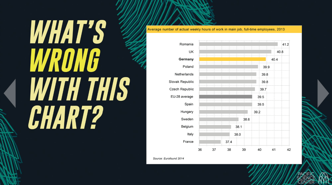
Can we always trust what we see in charts and graphs? Data visualizations can be useful in translating complex data into more universal visual stories but their versatility can also lead to accidental distortion or intentional manipulation.
The Pacific Science Center in Seattle, working with the Center for an Informed Public (CIP) at the University of Washington (UW), has created and launched a new virtual exhibit called “Uncovering Reality,” designed to help you spot the common ways people use graphs, charts and other data visualizations to misrepresent reality and understand why that matters. Part of the exhibit includes quizzes that ask you to identify the errors in certain problematic charts and graphs.
CIP faculty Jevin West, an associate professor at the UW Information School, and Carl Bergstrom, a UW biology professor, advised the Pacific Science Center on the development of the virtual exhibit.
“When data shows up as a pretty visualization, it sometimes carries more credibility than it should. Be on the lookout for misleading claims in data graphics just as you would in words and rhetoric,” West said.

